Introduction to CSS Grid
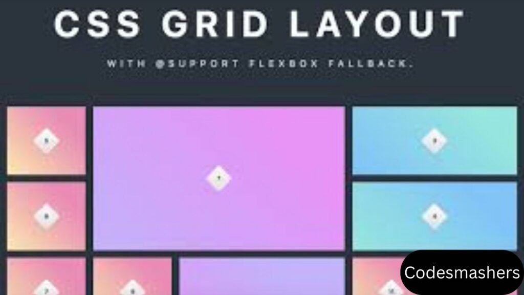
In the dynamic world of web development, creating visually appealing and structurally sound layouts is paramount. Enter CSS Grid, a revolutionary layout framework that is transforming the way we create web pages. CSS Grid provides a two-dimensional layout framework that lets developers manipulate both rows and columns at the same time, in contrast to more conventional techniques like floats and Flexbox. This opens up possibilities for creating complex and responsive web designs with ease.

CSS Grid’s importance in web design cannot be overstated. It simplifies the process of building intricate layouts, making it an indispensable tool for web developers, UX designers, and CSS enthusiasts alike. Whether you’re looking to create a simple grid-based layout or an intricate design with overlapping elements, CSS Grid has you covered.
In this detailed article, we will explore modern techniques for mastering in CSS Grid. We’ll start with the fundamentals and gradually move into more complex topics, including responsive design strategies, real-world examples, browser compatibility, and performance considerations. By the end of this article, you’ll have the knowledge and skills to create stunning, responsive web layouts using CSS Grid.
Understanding the Fundamentals
At its core, CSS Grid is a layout system that allows you to create grids using rows and columns. Let’s break down some fundamental concepts:
Grid Container and Grid Items
The grid container is the parent element that holds grid items (child elements). To explain a grid container, we apply the ‘display: grid’ attribute to the parent element. The child elements within this container become grid items that can be positioned within the grid.
Grid Tracks
Grid tracks are the horizontal and vertical lines that make up the grid. The `grid-template-rows` and `grid-template-columns` properties define them. For example, ‘grid-template-columns: 1fr 1fr’ generates two columns with equal widths.
Grid Cells
A grid cell is the area between two adjacent grid lines. It indicates the lowest unit of space in the grid where items can be placed. Grid cells provide the flexibility to position items precisely where you want them.
Grid Lines
Grid lines are the dividing lines between grid tracks. They are numbered, starting from 1 at the beginning of the grid. These lines are useful to refer to when utilizing the `grid-column` and `grid-row` properties to arrange grid objects.
Understanding these fundamental concepts is essential for working with CSS Grid. Once you’re comfortable with the basics, you can start seeking more advanced techniques to create intricate layouts.

Advanced CSS Grid Techniques
Now that we’ve covered the fundamentals, let’s get into some advanced CSS Grid approaches. These techniques will enable you to create more complex and visually stunning web layouts.
Grid-template-areas
The `grid-template-areas` property allows you to define named grid areas within your grid container. This makes it easier to place grid items in specific sections of the grid. Here’s an example:
“`
.container {
display: grid;
grid-template-areas:
“header header”
“sidebar content”
“footer footer”;
grid-template-rows: auto 1fr auto;
grid-template-columns: 200px 1fr;
}
.header {
grid-area: header;
}
.sidebar {
grid-area: sidebar;
}
.content {
grid-area: content;
}
.footer {
grid-area: footer;
}
“`
The header, sidebar, content, and footer are the four sections of the grid that we’ve defined in this example. Each part is assigned to a grid item using the `grid-area` property.

Grid-template-columns and Grid-template-rows
Your grid’s columns and rows can be customized by using the `grid-template-rows` and `grid-template-columns` attributes. You can use various units, such as pixels, percentages, and fractions (fr). Here’s an example:
“`
.container {
display: grid;
grid-template-columns: 100px 1fr 2fr;
grid-template-rows: 50px 200px;
}
“`
In this example, we have three columns with widths of 100px, 1fr, and 2fr, respectively. The rows have heights of 50px and 200px. This flexibility allows you to create grids with varying column and row sizes.
Grid-auto-flow
The `grid-auto-flow` property controls how grid items are placed within the grid when they are not explicitly positioned. By default, items are placed in row order, but you can change this behavior using the `grid-auto-flow` property. For example, `grid-auto-flow: column` places items in column order.
These advanced techniques open up numerous possibilities for creating intricate and visually appealing layouts. Experiment with different combinations to get the wished results.
Responsive Design with CSS Grid
The capability of CSS Grid to generate responsive layouts is one of its primary advantages. In today’s mobile-first world, ensuring your web design looks great on all devices is crucial. Let’s explore some strategies for creating responsive designs with CSS Grid.
Media Queries
You may also apply for various styles according to the screen size by using media queries. Designing responsive layouts is made possible by CSS Grid’s support for media queries. Here’s an example:
.container {
display: grid;
grid-template-columns: 1fr;
}
@media (min-width: 768px) {
.container {
grid-template-columns: 1fr 1fr;
}
}
@media (min-width: 1024px) {
.container {
grid-template-columns: 1fr 1fr 1fr;
}
}
This example offers three layout options: single-column for small screens, two-column for moderate devices, and three-column for large screens. Adjust the grid-template-columns property based on the screen size to create responsive designs.
Minmax() Function
The `minmax()` function allows you to set a range for the size of grid tracks. This is specifically advantageous for making responsive layouts. Here’s an example:
“`
.container {
display: grid;
grid-template-columns: repeat(auto-fill, minmax(200px, 1fr));
}
“`
In this example, the `minmax()` function ensures that each column is at least 200 pixels wide and can expand to fill the available space. The `repeat(auto-fill,…)` syntax automatically creates as many columns as possible within the container.
Auto-fit and Auto-fill
The `auto-fit` and `auto-fill` keywords can be used with the `repeat()` function to create responsive grids. Here’s an example:
“`
.container {
display: grid;
grid-template-columns: repeat(auto-fit, minmax(150px, 1fr));
}
“`
In this example, the `auto-fit` keyword ensures the columns resize to fit the available space, while the `minmax()` function sets a minimum and maximum width for each column. This enables a grid to be responsive, meaning it can adjust to different screen sizes.
With CSS Grid, these techniques let you make responsive and adaptable designs. In this we can experiment with different combinations to get the desired results.

Real-world Examples
To illustrate the power of CSS Grid, let’s explore some real-world examples of complex layouts created with CSS Grid. We’ll break down the code for each example to show how you can achieve similar results.
Example 1: Magazine Layout
A magazine-style layout often features multiple columns, rows, and overlapping elements. Here’s an example:
“`
.container {
display: grid;
grid-template-columns: repeat(3, 1fr);
grid-template-rows: auto;
gap: 20px;
}
.header {
grid-column: 1 / -1;
}
.article {
grid-column: span 2;
}
.sidebar {
grid-column: span 1;
}
“`
In this example, we have a three-column grid with a header spanning the entire width. The article spans two columns, while the sidebar occupies one column. The `gap` property add spacing between grid elements.
Example 2: Portfolio Layout
A portfolio layout often features a grid of images with varying sizes. Here’s an example:
“`
.container {
display: grid;
grid-template-columns: repeat(auto-fill, minmax(250px, 1fr));
gap: 10px;
}
.item {
grid-column-end: span 2;
}
“`
In the above example, we use the `repeat(auto-fill, minmax(250px, 1fr))` syntax to make a responsive grid. The `grid-column-end` property allows certain items to span multiple columns, creating a dynamic and visually appealing layout.
Example 3: E-commerce Product Grid
An e-commerce product grid often features products with varying heights. Here’s an example:
“`
.container {
display: grid;
grid-template-columns: repeat(auto-fit, minmax(150px, 1fr));
gap: 15px;
}
.product {
grid-row-end: span 2;
}
“`
In this example, we use the `repeat(auto-fit, minmax(150px, 1fr))` syntax to create a responsive grid. The `grid-row-end` property allows certain products to span multiple rows, accommodating items with varying heights.
These illustrations show how versatile CSS Grid is for building intricate and eye-catching layouts. In this we can experiment with different combinations to get the desired results.
Browser Compatibility and Fallbacks
A seamless user experience requires cross-browser compatibility. While most advanced browsers support CSS Grid, it’s critical to include fallbacks for older browsers.
CSS Grid Support
CSS Grid is supported in the latest versions of major browsers, including Chrome, Firefox, Safari, Edge, and Opera. However, older versions may not support all features of CSS Grid.
Using Feature Queries
Feature queries allow you to apply styles conditionally based on browser support. Here’s an example:
“`
@supports (display: grid) {
.container {
display: grid;
grid-template-columns: 1fr 1fr;
}
}
@supports not (display: grid) {
.container {
display: flex;
flex-direction: column;
}
}
“`
In this example, if the browser supports CSS Grid, grid styles are applied using the `@supports} rule. If not, we fall back to using Flexbox.
Graceful Degradation
Graceful degradation involves providing a basic layout for older browsers while enhancing the experience for modern browsers. Here’s an example:
“`
.container {
display: flex;
flex-direction: column;
}
@supports (display: grid) {
.container {
display: grid;
grid-template-columns: 1fr 1fr;
}
}
“`
In this example, we start with a flexbox layout as the fallback and enhance it with CSS Grid for browsers that support it.
By using feature queries and graceful degradation, you can ensure compatibility and provide a seamless user experience.
Performance Considerations
Optimizing performance is crucial, especially for complex layouts. While CSS Grid is powerful, it’s important to consider performance implications.
Minimize Repaints and Reflows
Performance can be affected by repaints and reflows, particularly in intricate layouts. Minimize layout changes and avoid using JavaScript to manipulate the DOM unnecessarily.
Use Efficient Selectors
Efficient selectors can improve rendering performance. Avoid using overly complex selectors and favor class selectors for better performance.
Optimize Images
Large images can slow down page loading times. Optimize images by compressing them and using responsive image techniques to serve different image sizes based on the device.
By considering these performance tips, you can ensure that your CSS grid layouts are visually appealing but also performant.
Conclusion:
Mastering CSS Grid opens a world of possibilities for creating complex and responsive web layouts. This tutorial has given you the knowledge and abilities to use CSS Grid effectively, from grasping the fundamentals to investigating more complex strategies.
Whether you’re a web developer, UX designer, or CSS enthusiast, incorporating CSS Grid into your toolkit will enhance your ability to create visually stunning and structurally sound web designs. Remember to experiment with different techniques, optimize for performance, and ensure compatibility across different browsers.
Ready to take your web design skills to the next level? Start implementing CSS Grid in your projects today and experience the power of advanced layout techniques.
For more insights and tutorials on web development, don’t forget to explore our other articles and resources. Happy designing!

