Introduction to CSS
A key tool in web development, Cascading Style Sheets (CSS) lets programmers specify how web pages should be presented and laid out. It works with HTML and JavaScript to build visually appealing and interactive web applications. While HTML structures the content, CSS styles it, bringing the elements to life through colors, fonts, and layouts.
By keeping content and design distinct, CSS attempts to make it easier for developers to update and maintain websites. By using it, you can ensure a consistent look and feel across multiple web pages, ultimately enhancing the user experience.
The Evolution of CSS
It has undergone significant transformations since its inception. Here’s a brief look at its evolution:
1. Cascading Style Sheet 1 (1996):
The original CSS specification introduced basic styling capabilities, including font properties, color, and text alignment.
2. Cascading Style Sheet 2 (1998):
This version expanded on Cascading Style Sheet 1, adding support for media types (e.g., print, screen) and positioning of elements, which allowed more control over layouts.
3. Cascading Style Sheet 2.1 (2011):
An updated version of Cascading Style Sheet 2 that corrected errors, clarified and introduced a few new features, such as improved handling of the box model.
4. Cascading Style Sheet 3 (2009-Present):
Cascading Style Sheet 3 brought modularization, allowing developers to adopt new features incrementally. It introduced many enhancements, including rounded corners, shadows, gradients, transitions, and animations.
5. Cascading Style Sheet 4 (Ongoing Development):
While not an official specification, discussions and drafts for Cascading Style Sheet 4 aim to add more sophisticated features, such as namespaces, advanced selectors, and enhanced layout capabilities.
How CSS Designs the Web
It transforms plain HTML into visually compelling web pages. Here are some key elements and examples demonstrating how It designs the web:
Basic CSS Syntax
The main components of the this language comprise selectors and statements.
Example:
/* Selector */
p {
/* Declaration Block */
color: blue; /* Declaration */
font-size: 16px; /* Declaration */
}
In the example above, the selector `p` targets all `<p>` elements, applying the declared styles—blue text color and a font size of 16 pixels.
Styling Text and Colors
It allows fine-grained control over text and colors.
Example:
h1 {
font-family: ‘Arial, sans-serif’;
font-size: 24px;
color: #333333;
}
a {
color: #1e90ff;
text-decoration: none;
}
hover {
text-decoration: underline;
}
The code above styles headings (`<h1>`) with a specific font and color, while also defining link (`<a>`) styles and hover effects.
Layouts
It provides various techniques for arranging elements on a web page, including Flexbox and Grid:
Flexbox Example:
.container {
display: flex;
justify-content: center;
align-items: center;
height: 100vh;
}
.item {
padding: 20px;
background-color: #f0f0f0;
border-radius: 5px;
margin: 10px;
}
Grid Example:
.grid-container {
display: grid;
grid-template-columns: repeat(3, 1fr);
gap: 10px;
}
.grid-item {
background-color: #f0f0f0;
padding: 20px;
border-radius: 5px;
}
These illustrations show how responsive and adaptable layouts can be made using Flexbox and Grid.
Making the Web Responsive
The optimal viewing experience is guaranteed by responsive web design, allowing websites to adapt to different screen sizes and devices. When using media queries to achieve responsiveness, It is essential:
Media Queries
Media queries allow you to apply different styles based on the device’s characteristics, such as width, height, and orientation.
Example:
.container {
width: 100%;
padding: 20px;
}
@media (min-width: 600px) {
.container {
width: 80%;
margin: 0 auto;
}
}
@media (min-width: 1024px) {
.container {
width: 60%;
}
}
In this example, the `container` element adjusts its width and margin based on the device’s screen width, ensuring a responsive layout.
CSS Frameworks and Libraries
CSS frameworks and libraries expedite development and ensure responsiveness. Some popular options include:
Bootstrap
Bootstrap is a widely used framework that provides pre-designed components and responsive grid systems.
Example:
<link rel=”stylesheet” href=”https://maxcdn.bootstrapcdn.com/bootstrap/4.5.2/css/bootstrap.min.css”>
<div class=”container”>
<div class=”row”>
<div class=”col-sm”>
Column 1
</div>
<div class=”col-sm”>
Column 2
</div>
<div class=”col-sm”>
Column 3
</div>
</div>
</div>
Tailwind CSS
With Tailwind CSS, creating unique designs is a breeze because of its utility-focused framework.

Example:
html
<link rel=”stylesheet” href=”https://cdn.jsdelivr.net/npm/tailwindcss@2.0.0/dist/tailwind.min.css”>
<div class=”container mx-auto p-4″>
<div class=”grid grid-cols-3 gap-4″>
<div class=”bg-gray-200 p-4 rounded”>
Column 1
</div>
<div class=”bg-gray-200 p-4 rounded”>
Column 2
</div>
<div class=”bg-gray-200 p-4 rounded”>
Column 3
</div>
</div>
</div>
Best Practices in CSS
Writing clean and efficient code enhances maintainability and performance. Here are some best practices:
- Use Classes and IDs:
Avoid using inline styles. Instead, define reusable classes and IDs in your file:
Example:
.btn-primary {
background-color: #007bff;
color: white;
padding: 10px 20px;
border-radius: 5px;
border: none;
}
html
<button class=”btn-primary”>Click Me</button>
“`
- Organize Your CSS:
Split into sections for better readability. Use comments to label different parts of your style sheet:
* Base styles */
body {
font-family: ‘Arial, sans-serif’;
color: #333333;
}
/* Header styles */
header {
background-color: #f8f8f8;
padding: 20px;
text-align: center;
}
* Button styles */
.btn {
padding: 10px 20px;
border-radius: 5px;
border: none;
cursor: pointer;
}
.btn-primary {
background-color: #007bff;
color: white;
}
- Leverage Preprocessors:
Its preprocessors like Sass and Less allow you to write more maintainable and modular code. They provide features such as variables, nesting, and mixes.
Sass Example:
$primary-color: #007bff;
$secondary-color: #6c757d;
body {
font-family: ‘Arial, sans-serif’;
color: $secondary-color;
}
.btn {
padding: 10px 20px;
border-radius: 5px;
border: none;
cursor: pointer;
&-primary {
background-color: $primary-color;
color: white;
}
}
The Future of CSS
New features and capabilities that improve web design and responsiveness are constantly being added to develop it. Here are some emerging features:
Grid Layout
A Grid the CSS Layout makes it effortless for developers to create intricate, adaptable layouts:
Example:
.grid-container {
display: grid;
grid-template-columns: repeat(3, 1fr);
grid-gap: 10px;
}
.grid-item {
background-color: #f0f0f0;
padding: 20px;
border-radius: 5px;
}
CSS Custom Properties (Variables)
Its Custom Properties enable developers to define and reuse variables in their stylesheets, promoting consistency and maintainability.
Example:
: root {
–primary-color: #007bff;
}
.btn-primary {
background-color: var(–primary-color);
}
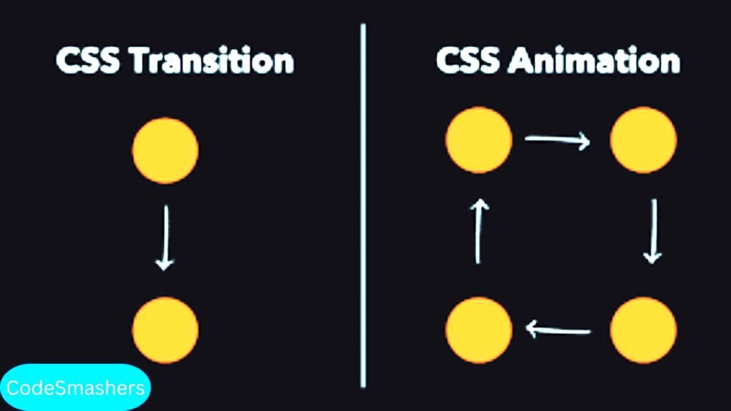
CSS Animations and Transitions
Without the need for JavaScript or other third-party libraries, CSS animations and transitions enable the creation of captivating and dynamic web design elements.
Example:
.box {
width: 100px;
height: 100px;
background-color: #f0f0f0;
transition: transform .3s ease-in-out;
}
